The browser is the component model
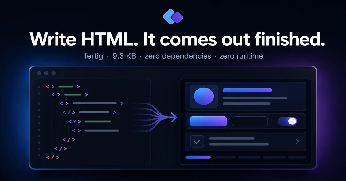
Fertig starts with ordinary HTML. A page links one stylesheet, then uses the elements it already needs: headings, forms, tables, progress bars, dialogs, popovers, navigation and feedback. The visual system comes from the document rather than a tree of framework components.
<link rel="stylesheet" href="https://cdn.jsdelivr.net/npm/fertig@4/fertig.min.css">

<main>
  <h1>Invoices</h1>
  <progress value="72" max="100">72%</progress>
  <button popovertarget="new">New invoice</button>
  <form popover id="new">...</form>
</main>
There are seven optional classes for cases HTML cannot express on its own: rows, grids, cards, badges, muted text, centered content and wide content. Everything else is selected through elements and meaningful attributes.
One file, deliberately
The package ships a readable stylesheet and its minified build. It has no runtime, JavaScript dependency or build requirement for consumers. It works from npm, a CDN link or a copied CSS file, which keeps adoption and removal to one line either way.
The constraint prevents a second API from growing beside HTML. Native dialogs, popover controls and disclosures keep their browser behaviour; Fertig supplies their layout, states, motion and visual hierarchy.
Modern CSS does the structural work
OKLCH colour ramps and light-dark() provide one token system across light and
dark themes. Logical properties make the same layout work in left-to-right and
right-to-left documents. Cascade layers let application CSS override the
library without specificity contests.
The sheet also uses the platform features it is designed around — :has(),
container queries, the top layer and @starting-style — instead of carrying
legacy fallbacks. That is the central trade-off: a smaller, clearer stylesheet
for current browsers rather than a compatibility layer for old ones.
Defaults that hold up outside the demo
The system covers dense controls as well as article typography: validation states, input groups, switches, tabs, menus, listboxes, tables, empty states, drawers, toasts and code highlighting. Focus remains visible, semantic colour pairs meet WCAG AA contrast targets, and motion is disabled when the user asks for reduced motion.
Responsive overflow and long-content cases are handled in the stylesheet, not left to each example. The same components are exercised in narrow viewports, dark mode and RTL layouts so the defaults remain useful after the first screen.
Documentation that runs the real stylesheet
The Astro site is built around live output rather than isolated screenshots. Its editable HTML example updates the preview directly, and the component and block catalogues expose formatted markup with copy controls. The documentation therefore dogfoods the same published CSS a consumer downloads.
Releases cannot drift silently
Each source change is fingerprinted. The commit gate advances the patch version, rebuilds the minified file, refreshes measured bundle sizes and checks that package metadata, CSS banners, documentation and release state agree. Packaging tests also verify the exact files and exports npm will receive.
That turns versioning from a reminder into a property of the repository: a changed release cannot be committed while still claiming the previous version.
Explore the live documentation, inspect
the source on GitHub, or install
fertig from npm.